VPRO
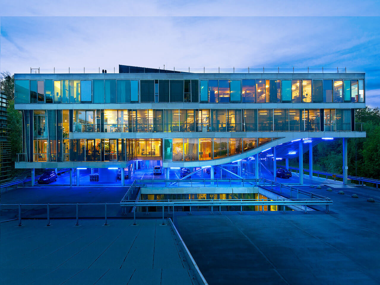
Crafting a Seamless Digital Experience for VPRO
VPRO is known for pushing creative boundaries in public broadcasting, but its digital landscape told a different story—fragmented platforms, inconsistent experiences, and a complex editorial workflow. Each platform functioned in isolation, making it harder for teams to collaborate efficiently, share resources, and ensure a seamless user experience.
With multiple brands under its umbrella—each with unique editorial needs and visual identities yet relying on a shared technical foundation—we faced a challenge: How do we create a scalable design system that harmonizes these diverse requirements without stifling creativity? This case study explores how I helped design a future-proof solution that unifies VPRO’s digital presence while preserving each brand’s distinct character
Balancing Consistency and Flexibility
Editorial teams once had full control over their own websites. Great for storytelling. Terrible for consistency. Navigating from the VPRO portal to a title like Brainwash felt like jumping between completely different platforms. Custom colors, DIY blocks, and inconsistent accessibility were the norm.
We changed that.
By introducing a shared design system and simplifying everything into two scalable white-label platforms, we created a consistent foundation across all brands. Editors still shape their stories and visuals—but within a system that’s accessible, maintainable, and ready to grow.

Designing for editorial and brand flexibility: A system tailored for storytelling
A modular future-proof foundation: tokens
We needed to find the right balance between consistency and flexibility. Consistency was essential to ensure that each brand or program remained recognizable as part of the omroep. At the same time, flexibility was crucial since many plussites had their own logos, colors, and graphic elements that needed to be incorporated to some extent.
Our solution lay in the use of design tokens. By establishing global tokens and a semantic token layer, we created a clear and consistent approach to color usage. Visual and brand designers could then carefully assign colors to each semantic token, ensuring brand coherence without sacrificing flexibility. This approach also allowed us to maintain WCAG2-compliant contrast-proof colors, ensuring accessibility across all brands. Additionally, we provided room for well-documented and discussed exceptions to introduce variation where necessary while maintaining structured flexibility.
Empowering editorial teams
To further improve efficiency, we transitioned from Magnolia CMS to Prepr CMS. This headless CMS enabled us to retain full control over the frontend experience while leveraging a robust, battle-tested backend for editorial teams.
We collaborated closely with the Prepr team to enhance the CMS’s user experience. By conducting user testing and research, and holding monthly meetings for technical and UI improvements, we shaped a system that genuinely catered to editorial needs. Over the course of a year, we tested new features and templates monthly with editorial teams, ensuring that workflows—from restructuring a homepage to publishing event articles—were intuitive and efficient. This iterative approach empowered editorial teams to work more effectively and with greater autonomy.
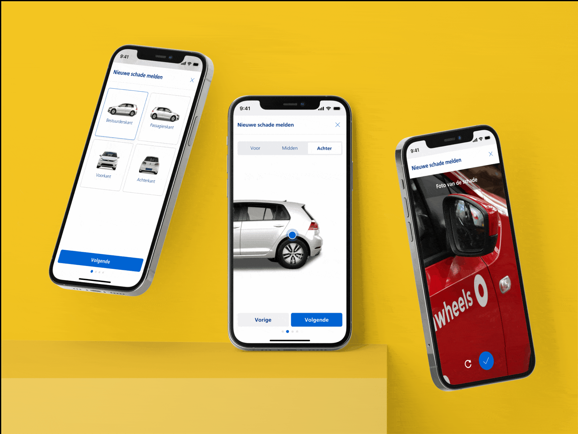
Jasper advanced our goal to become the top Mobility-as-a-Service provider in The Netherlands.
Liza Hidding, PO, Nederlandse Spoorwegen
Liza Hidding
Product Owner @ NS
Discovery & Strategy
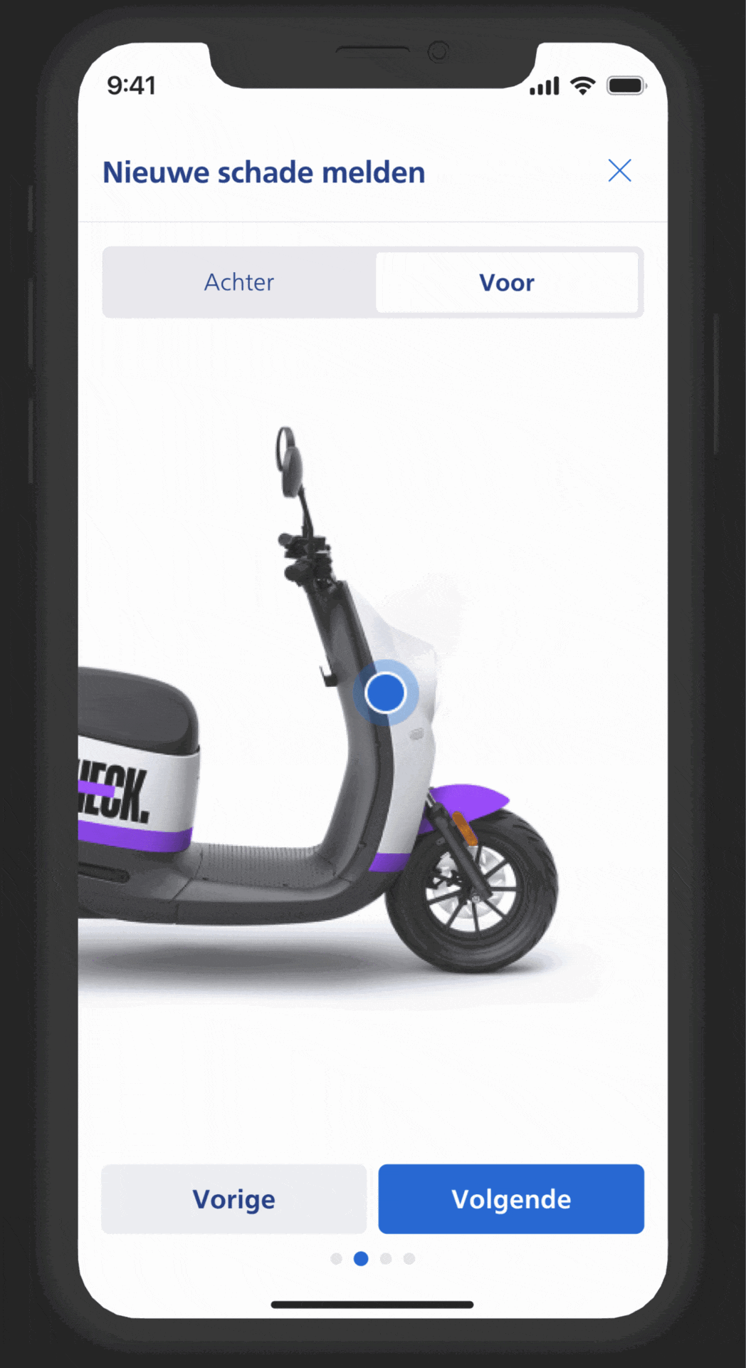
To create a seamless user journey, we developed a core booking flow with subtle customizations for each mobility service. Whether booking a car, e-bike, or scooter, users encounter a similar experience, streamlining the process while accommodating unique provider features.
This strategy ensures that users enjoy a consistent experience across different services while still benefiting from provider-specific options, such as vehicle information, pricing, and booking requirements. Our design adapts smoothly to meet NS’s need for flexibility, allowing rapid integration of new providers and services as the NS mobility offering expands.
Validation & Key Insights
To confirm our designs met user expectations, we conducted usability testing with nine users, exploring both car and scooter experiences. The user group included both frequent and occasional shared mobility users.
Key insights included:
- Smooth Booking Flow: Users interacted intuitively with primary buttons and navigation, completing tasks with minimal friction. However, some needed more detailed vehicle operation information.
- Tailored Information Needs: Novices appreciated step-by-step guidance, such as how to access and return vehicles, while experienced users favored a streamlined process without redundant instructions.
- Iterative Improvements: Testing revealed areas for enhancement:
- Vehicle Return Instructions: Adding pre-trip reminders on return policies helped users avoid confusion during drop-off.
- Adaptive Flow Options: Providing options to skip or expand steps helped both advanced and novice users navigate efficiently, offering an experience suited to each user type.
Nederlandse Spoorwegen
Client
2023
Year
Liza Hidding
Product Owner
Jasper Koenen
UX Designer
Lessons learned
VPRO, like many traditional broadcasters, has deep roots in linear television. While other media organizations had already embraced digital transformation, VPRO faced its own unique challenges.
The digital landscape was fragmented, and aligning multiple stakeholders—with different needs and ways of working—required patience and careful coordination.
Many of these stakeholders were editors, experienced in TV production but new to digital-first content. Introducing a unified design system meant helping them adjust to new workflows while preserving their creative freedom.
We approached this change through close collaboration. By addressing concerns early and showing the real benefits of a scalable design system, we gradually earned trust and support.
To keep the transition smooth, we focused on transparency and regular engagement. Presentations, check-ins, and collaborative sessions helped bridge the gap between old habits and new ways of working.
Involving editors throughout the process ensured the system supported their needs—instead of forcing rigid rules that disrupted their workflow.
This experience showed us the power of adaptability. By embracing collaboration and iteration, we delivered not just a design system, but a more digitally confident team—ready to tell great stories with new tools.
Outcome: a proofed new way of working
The rollout of the new design system is reshaping VPRO’s digital landscape. Half of the websites have already migrated to the new CMS, and editorial teams are actively using the new templates and components.
The impact is clear—where Magnolia once scored a 4 in satisfaction, Prepr CMS, combined with the structured design system, now earns a 9.
By focusing on scalability, usability, and flexibility, we have built a foundation that streamlines workflows while maintaining creative freedom. Editors can publish more intuitively, and developers benefit from reusable, efficient components. This system is designed to evolve, ensuring VPRO stays future-ready in an ever-changing digital world.